BRANDISAVERB — BRAND INTELLIGENCE FOR CREATIVE STUDIOS
NewsletterMay 2025

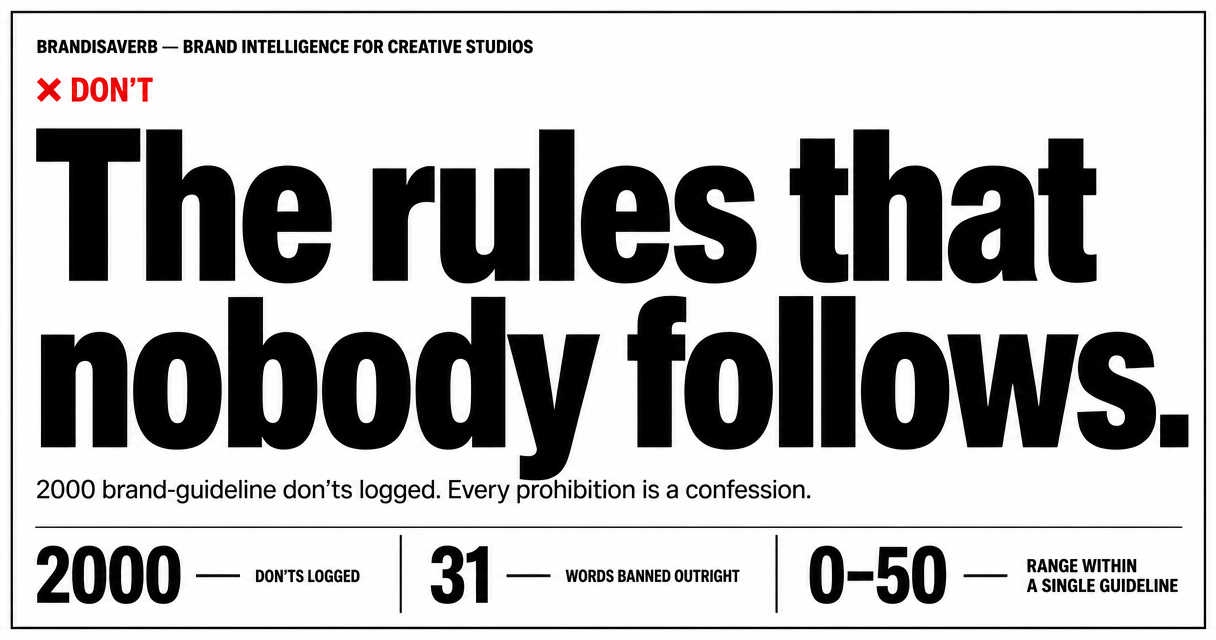
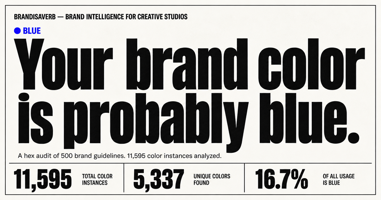
We read 500 brand guidelines so you don't have to. Here's what to cut.

Brand guidelines are supposed to make a brand easier to understand, use, and protect.

But after a while, many of them start to sound strangely familiar.

In the era of AI slop and prevailing brand sameness, you either say it best or say nothing at all.

The team at Corebook.io (a platform that hosts online brand guidelines for design teams) went through hundreds of brand guidelines in their library and documented the patterns. We thought their findings were too useful not to share.

Here's what shows up again and again, broken down by discipline.
+ Add section
01FOR THE STRATEGIST

The most overused phrases in brand positioning statements

"X is more than just Y"
Usually true, but rarely distinctive.
"We are not like other brands"
Tell us why?
"We enable… We empower…"
Useful in internal strategy, but less useful when every brand in the category claims them.
"X makes Y easier"
Easier how? For whom? Compared to what?
02FOR THE COPYWRITER

The most recycled taglines in the game

"Fast-track to your [freedom / growth / success]"
The metaphor is borrowed.
"Unleash your [full] potential"
Potential is not a caged animal.
"[Something] that simply works"
Good. But why would anyone assume it wouldn't?
"… here to stay"
So is your competition.

A note on tone-of-voice pairs that cancel each other out

  • – Authoritative yet Accessible
  • – Playful yet Professional
  • – Bold yet Approachable

Show how the tension actually plays out.

03FOR THE DESIGNER

What the font data tells us about branding trends

The grotesque takeover.
Over 60% of all fonts spotted are grotesque or neo-grotesque sans-serifs — a design movement from the 1800s that now dominates modern branding.
Gotham is still king.
If you're using it, you're in very good company. Despite being over 20 years old and famously used on Obama's 2008 campaign, Gotham is the single most-used licensed font across the library.
Serifs are rare, but deliberate.
Only ~9% of fonts were serifs. When brands choose one, EB Garamond, Lora, or Source Serif Pro, it's almost always paired with a sans-serif for contrast.
TT Fonts are having a moment.
Fonts like TT Crocs, TT Hoves Pro, and TT Commons had the most appearances from any single type foundry outside the major open-source providers.

Font Type Breakdown

  • Sans-serif — 82%
  • Serif — 9%
  • Display / Custom — 6%
  • Monospace — 3%

Top 15 Most-Used Fonts

Gotham
6%
Proxima Nova
5%
Poppins
4%
Montserrat
4%
Inter
4%
Figtree
3%
DM Sans
3%
Open Sans
3%
Gardena Sans
3%
Atlas Grotesk
2%
Manrope
2%
Matter
2%
Founders Grotesk
2%
Rubik
2%
Montserrat
2%

How we got here

The data in this issue comes from Corebook.io, a platform where design and creative teams host their online brand guidelines. Because thousands of brand guidelines live on their platform, Corebook° has a rare, broad view of how creative teams across industries document brand identity.

Sign up for the next issue

BRANDISAVERB

This newsletter is put together by Brandisaverb — a platform for research, insights, and discussion on branding and visual identity.